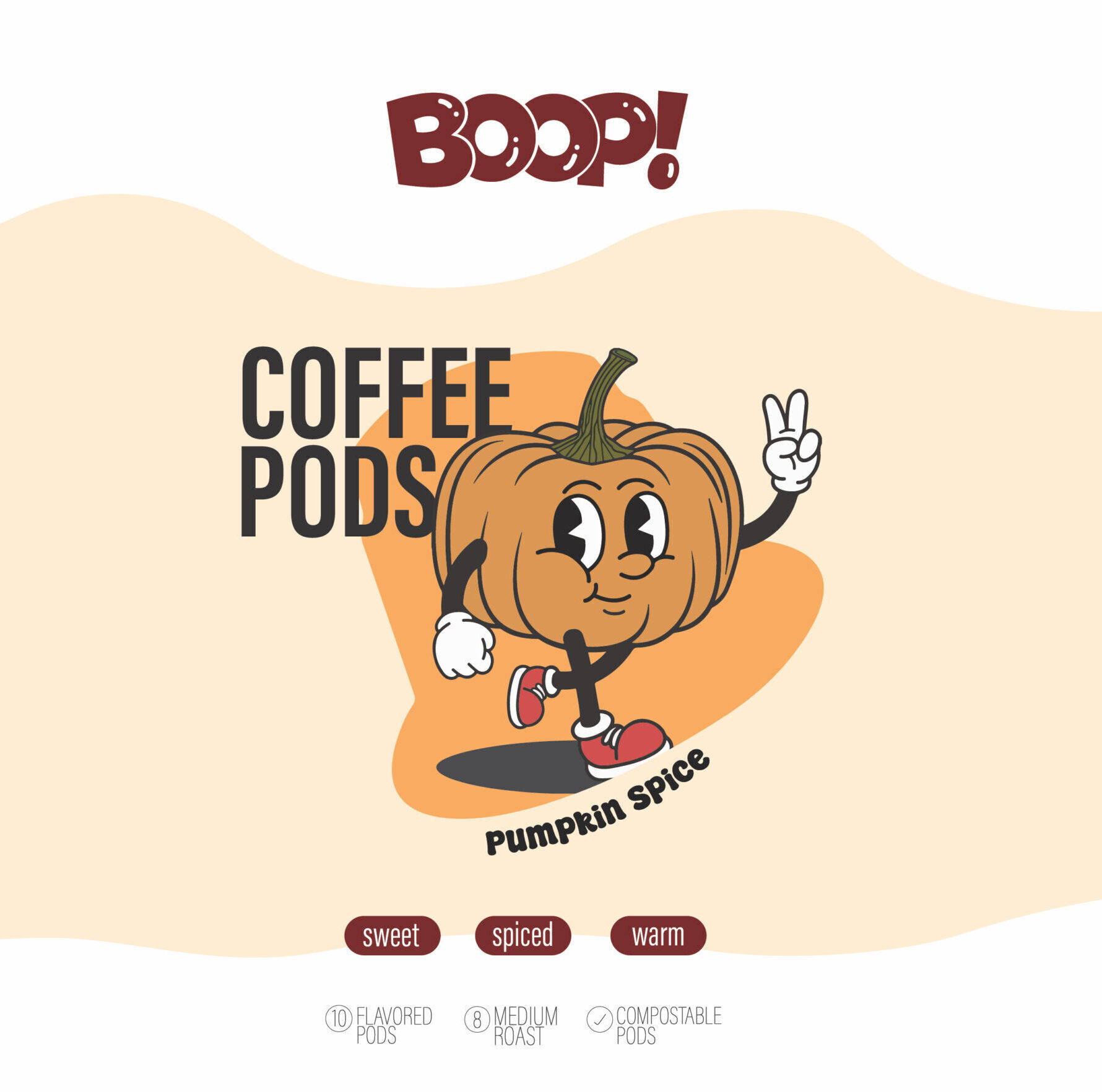
Concept & Vision
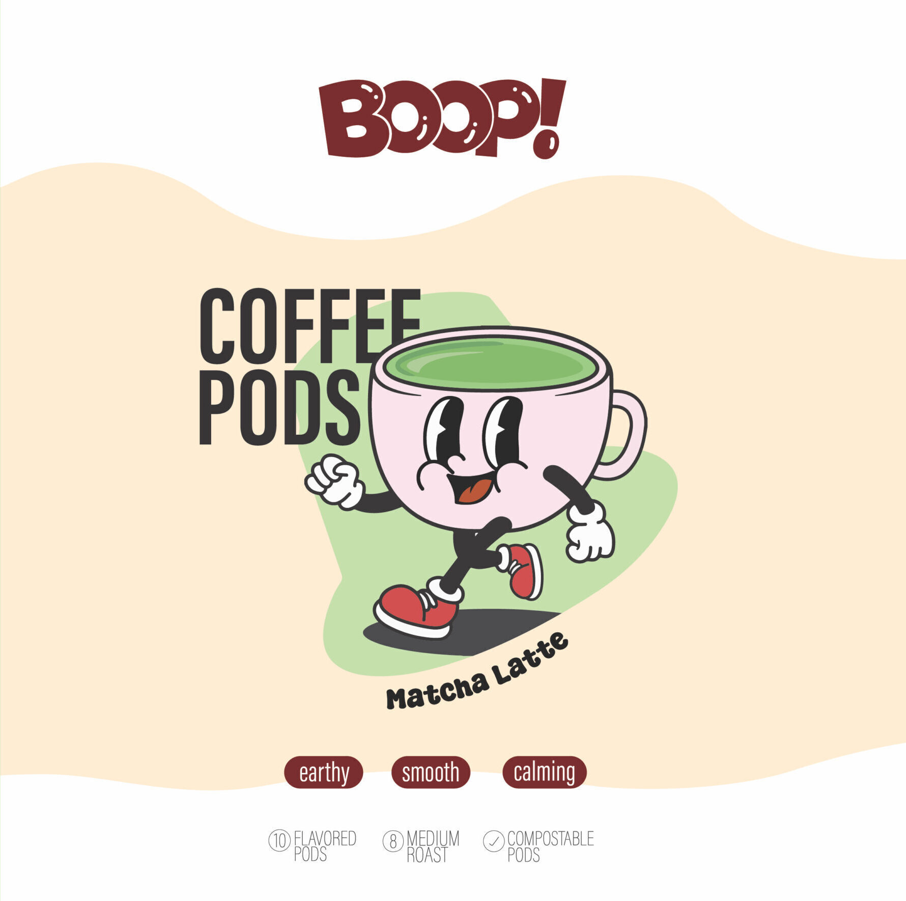
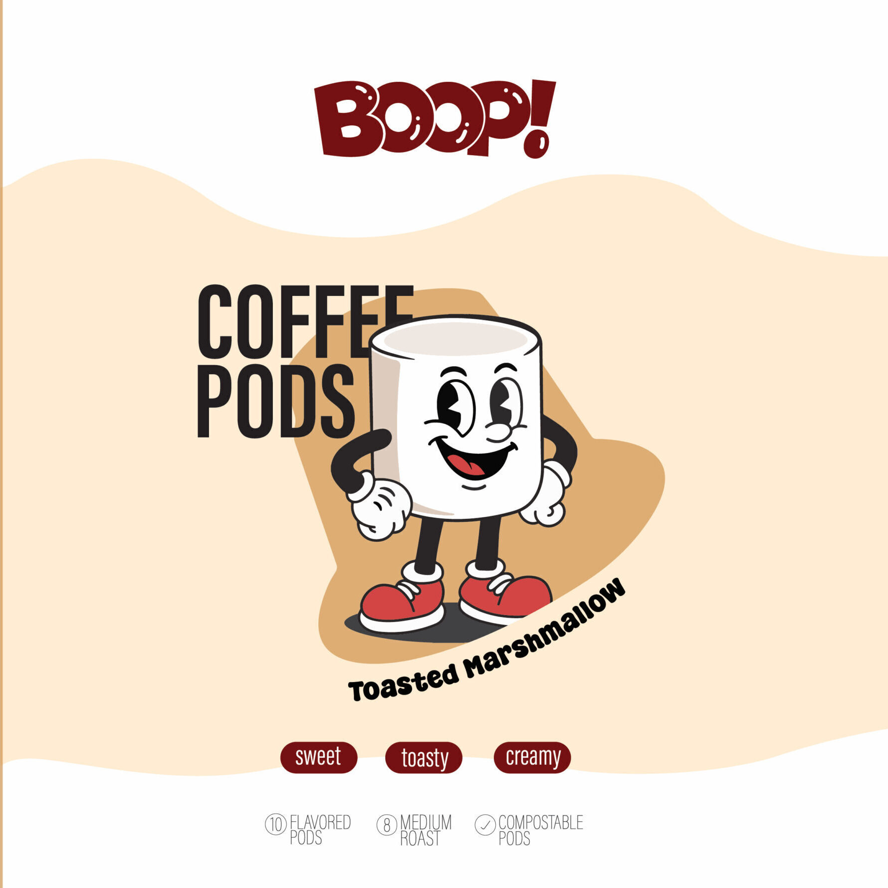
The goal was to create a playful, nostalgic, and character-driven packaging line for flavored coffee pods. Each flavor is represented by a fun mascot that immediately communicates the taste profile and mood. The vision was to blend retro cartoon charm with a clean, modern layout—making the product feel lively, friendly, and instantly eye-catching on shelves.
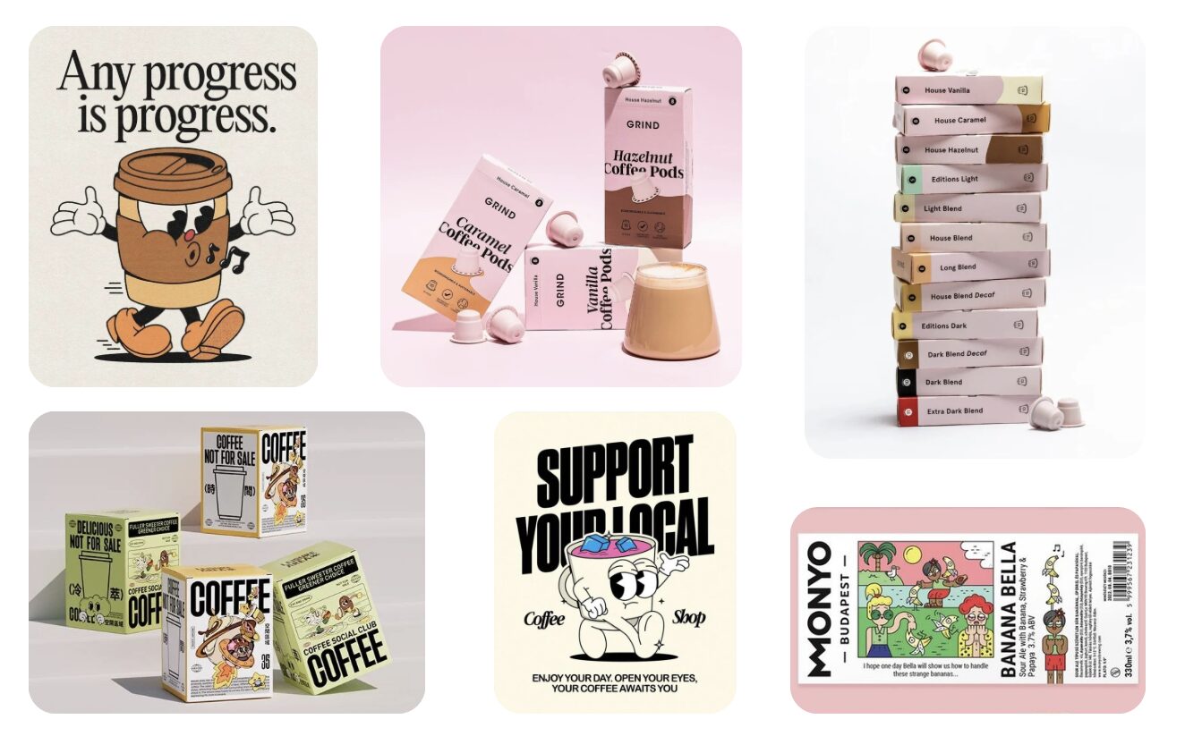
Research & Inspiration
The design direction was shaped by:
Vintage 1950s–70s cartoon mascots
Soft, rounded character design and expressive faces
Minimal packaging layouts with strong visual hierarchy
The emotional qualities tied to each flavor (sweet, calming, warm)
These references guided a brand identity that feels retro-inspired, modern, and personality-rich.
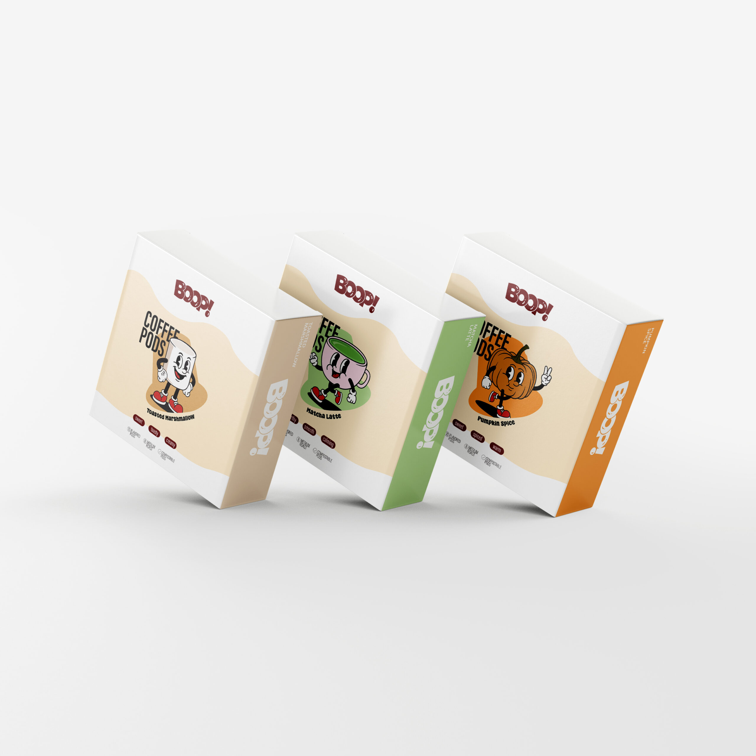
Colour Palette
Each flavor features a distinct color system for fast recognition:
Toasted Marshmallow: warm beige + caramel tones
Matcha Latte: soft greens + pastel pink
Pumpkin Spice: bright pumpkin orange + warm neutrals
A unified creamy beige background ties the entire line together while keeping the look soft and inviting.
Typography & Visual Style
Type choices support the playful but clean identity:
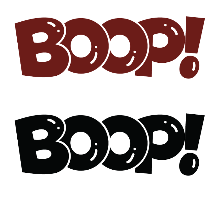
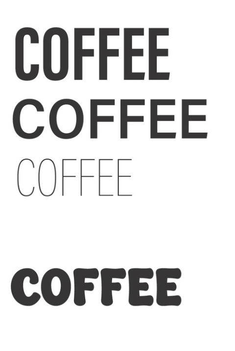
Acumin Variable Concept — used for most text; modern, versatile, and highly readable
Super Creamy — used for flavor words; rounded and fun to match the mascot energy
The visual style incorporates:
Retro-inspired illustrated mascots
Soft wave-shaped backgrounds
Clean spacing and strong hierarchy
Capsule-shaped descriptors (sweet, toasty, smooth, etc.)
This creates packaging that is structured but full of personality.
Outcome
The final series delivers a cohesive set of flavor-forward boxes that are lively, charming, and immediately memorable. Each mascot tells a playful story, supported by distinct colors and expressive typography. Together, the designs form a unified product line that stands out both individually and as a collection in retail settings.