Boop!
Category
PackagingAbout This Project
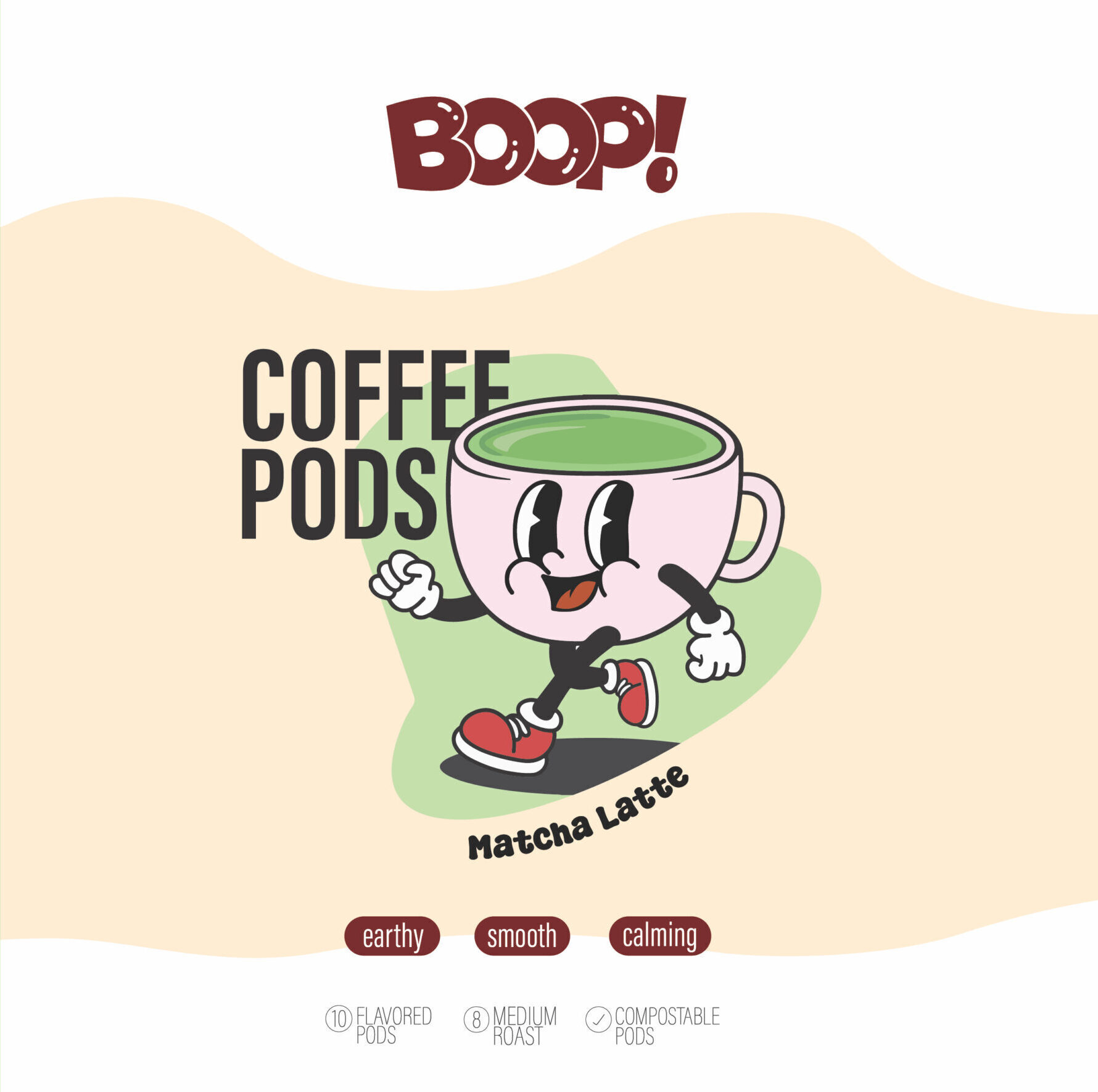
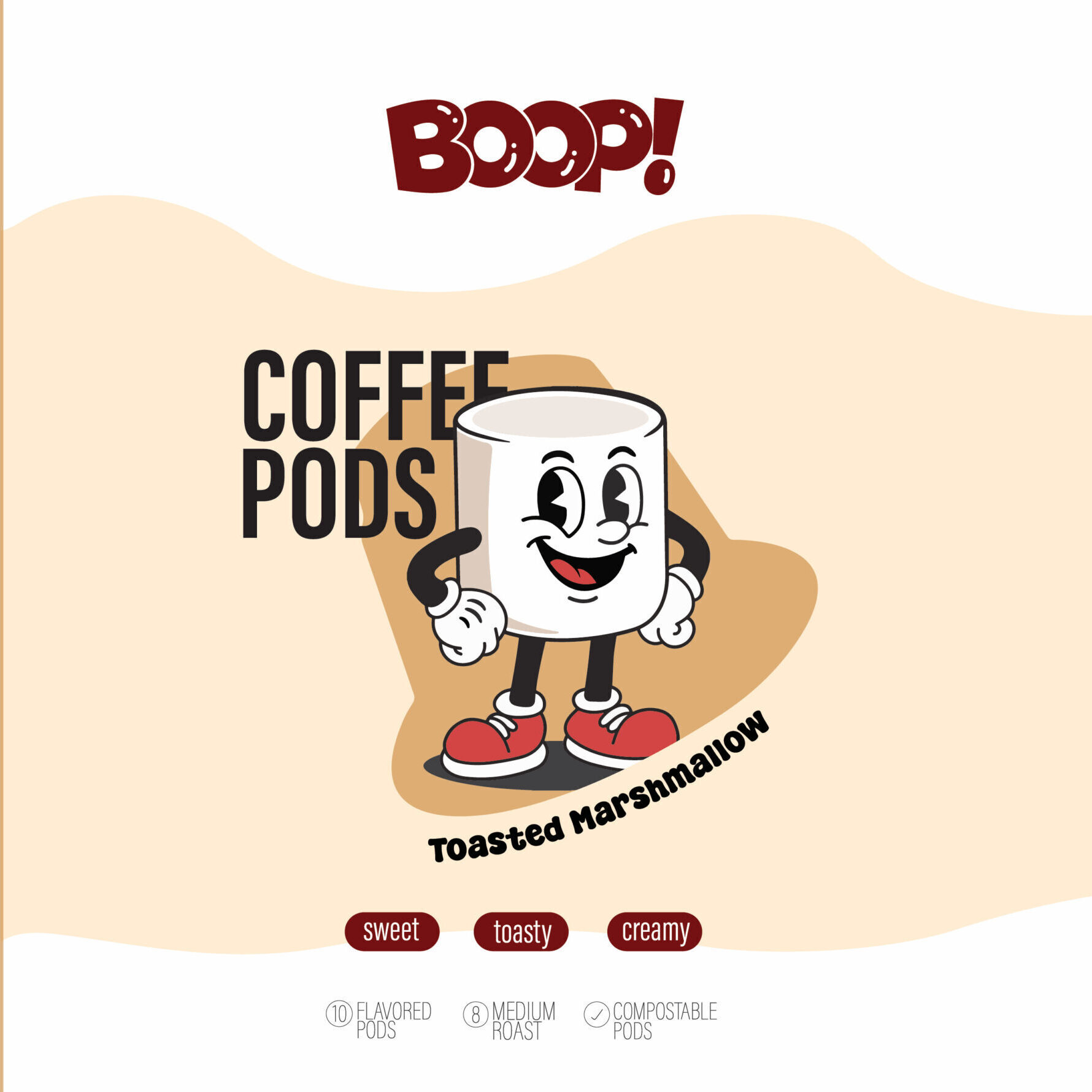
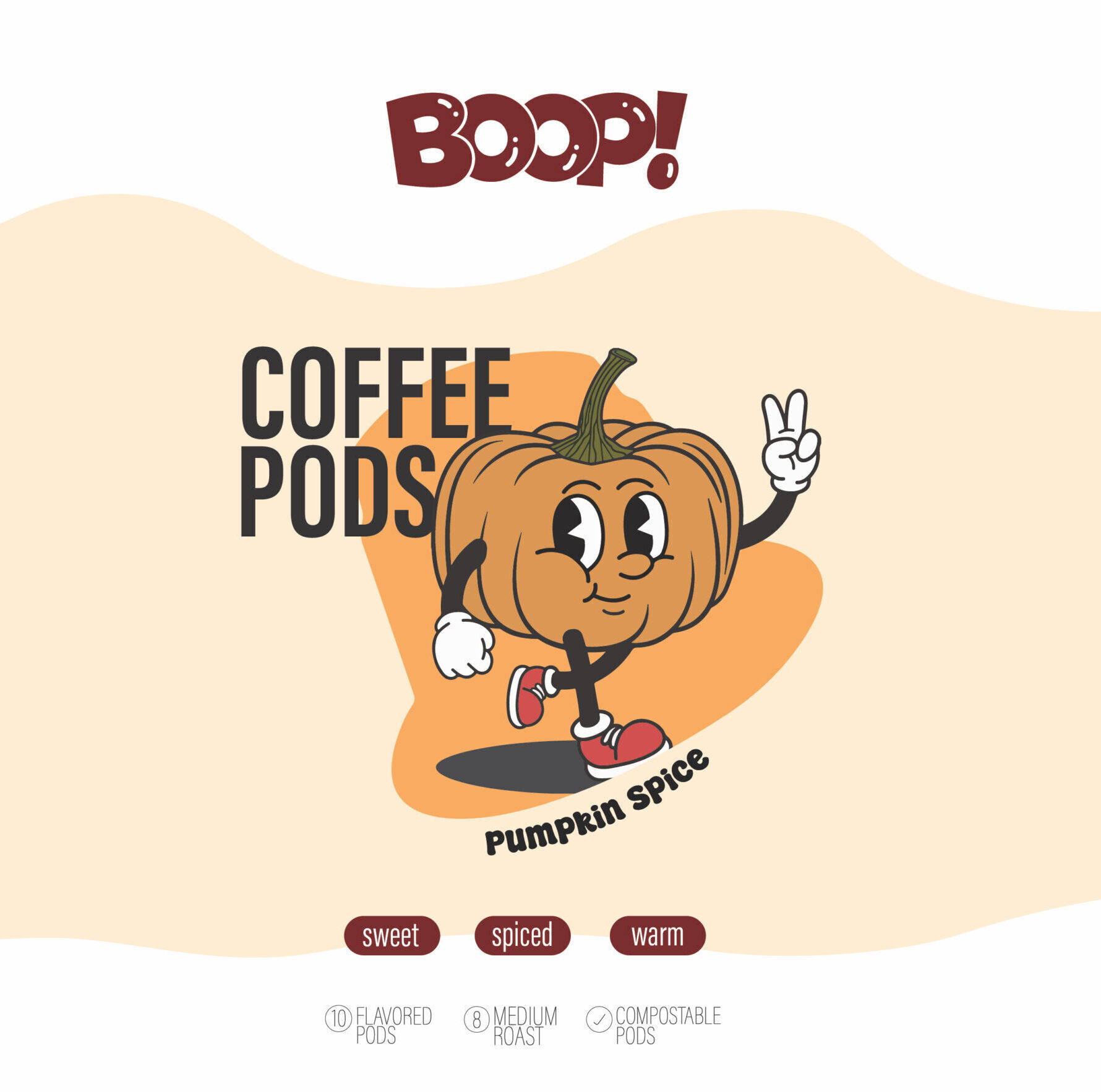
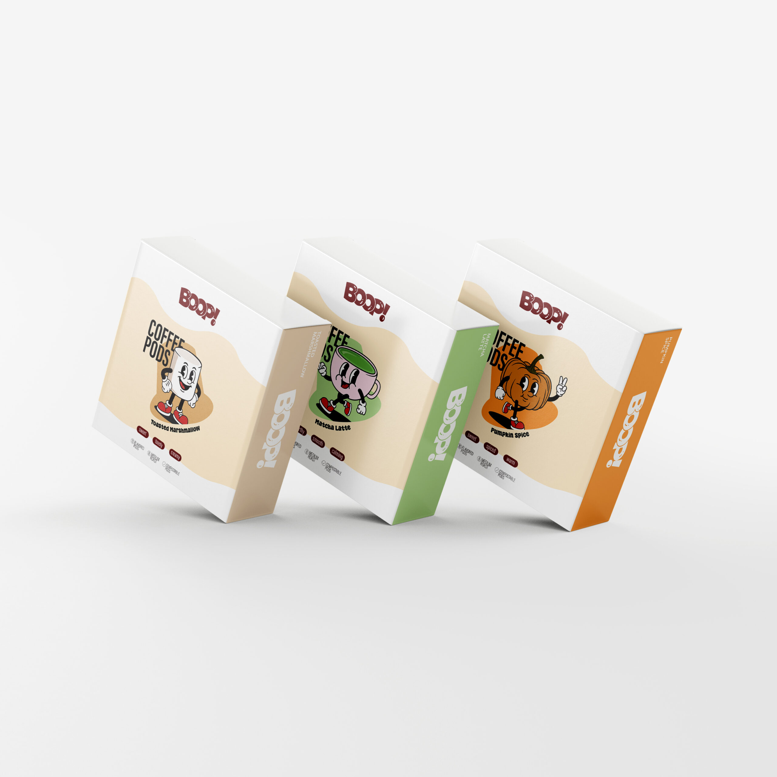
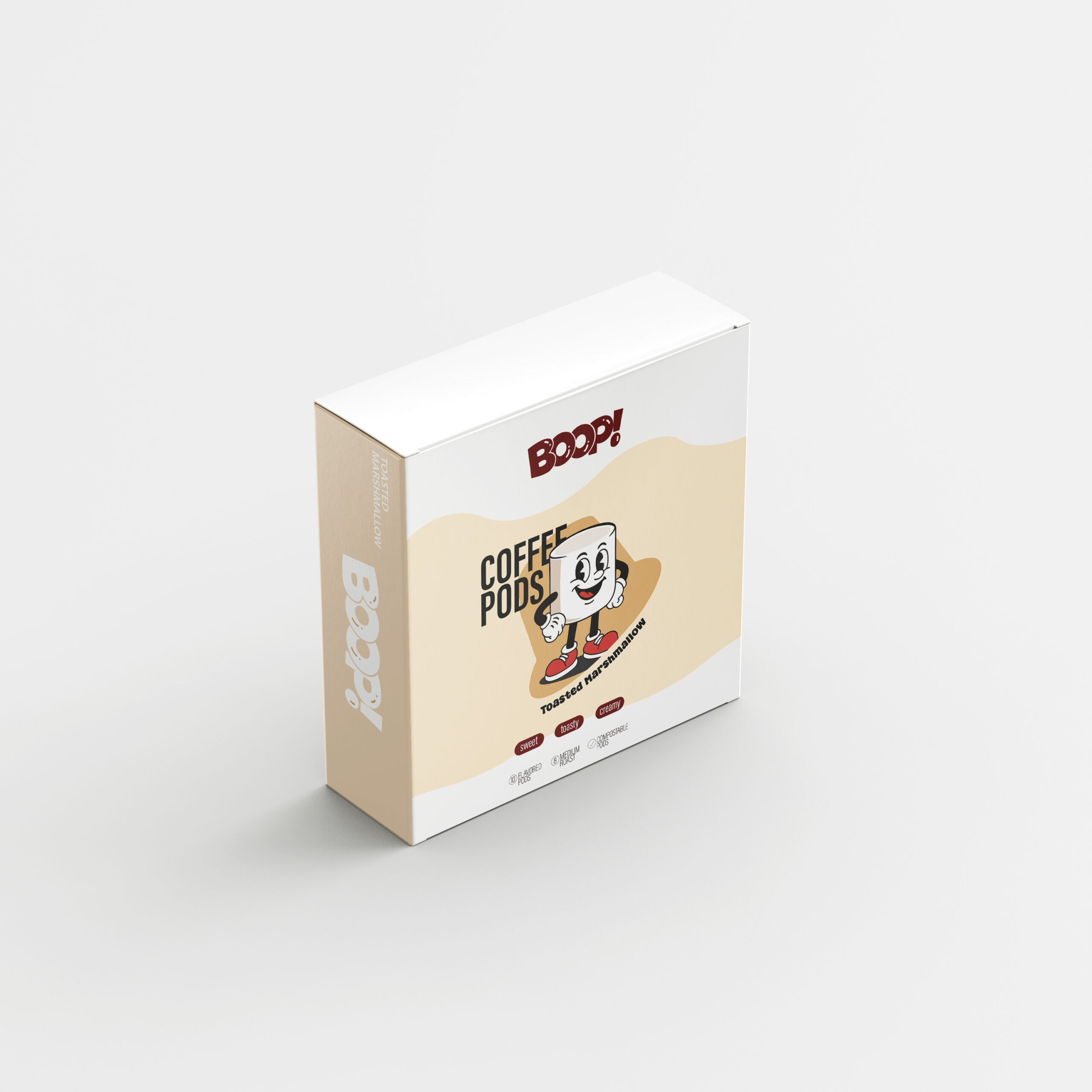
This coffee pods packaging I made called Boop! features a playful, cartoon-inspired aesthetic designed to make each flavor feel fun. I illustrated the characters in a vintage art style, giving each pod—Matcha Latte, Pumpkin Spice, and Toasted Marshmallow—its own quirky character that reflects its flavor. Soft, wavy shapes and warm pastel tones create a friendly look while the bold Boop! logo adds energy and consistency.
Each box uses a distinct accent color to differentiate the flavors, but maintains the same layout so the collection feels cohesive when displayed together. Descriptive flavor adjectives at the bottom give the consumer an idea of what it should taste like. Icons were added highlight the key product details like compostable pods, roast intensity, and its quantity. Overall, the design aims to be charming, modern, and memorable, giving everyday coffee pods a amusing identity.